Friday 30 March 2012

lesson evaluation


week 1- 

    . We created are accounts on blogger and started are artist research I decided to look at the artists Pablo
Picasso, Michael Bosanko, Cenci Goepel and Jens Warnecke. I thought these artists were good and had their own unique style to their work I particiularly liked Cenci Goepel and Jens Warnecke work I thought their light paintings were awesome because they have a unique style for their work, I also liked Michael Bosanko's Light paintings of animals.


. I enjoyed looking at the different artists and the work for next lesson I need to finish off the artist research and bring in different light objects for the photoshoot.

Week 2-

     . Today we did are light graffiti photoshoots I was in group of 3 with Mike and Pan we did are photos in the mac suite but it was too light so are photos didnt have darkness to get the light effect, are Nikon D40 was set up for a shutter speed of 4secs. We used are phone lights to do the exposure we also used a glow stick and coloured tissue paper  over are lights to make the colours. We then  went into are darker room which improved the quality of are photos by a lot. My favourite photo I took was of  a red spiral it came out perfect.

     . For next lesson Lauren will put up all the photos on the student shared area so we can look at them and put them into contact sheets for next lesson.

Week 3-

    . Todays lesson we put all of are photos into a contact sheet there were 44 photos in total and uploaded them to blogger we then had to evaluate all of the photos on the contact sheet. We then had to pick 6 of are best ones and develop them in photoshop and publish them on blogger I think my one turned out good, now all I need to do is write all of my evaluations.


Final ideas evaluation


Final idea 1

. For my first idea I took my phone light and placed my finger on top of it to create a red glow in my finger, with the Nikon D40 set to 4 second shutter speed, I then went on to draw a spiral image which turned out very good, I took this image and put it in adobe photoshop and messed around with the different filters to create a developed image I used the filter glow edges which made the image's colour stand out more which I think looks better.

Final idea 2

. For my second idea I used my phone light to draw random lines in the air I did the same red light by using my finger but took my finger away from the light to create the white lines, with the Nikon D40 set to 4 second shutter speed I also used a blue glow stick to create the blue lines under it. This photo turned out excellent I also took into photoshop and put the filter fresco on it, fresco creates a black overlay on the existing shadow areas, leaving highlight areas untouched it also adds a gray pixel pattern in the background.

Final idea 3

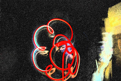
. For my third photo with the Nikon D40  set to 4 second shutter speed I took a spiral image using the colour red by using my finger over the light but letting go of the light to create a white light halfway through the spiral which turned out awesome it created a real contrast between red and white. I took into photoshop and but the fresco filter on it which creates a black overlay on the existing shadow areas, leaving highlight areas untouched it also adds a gray pixel pattern in the background.  When I did this it turned the white to the colour blue which creates an even bigger contrast between the colours.

Final idea 4

. For my fourth photo I created a picture resembling 2 boxes stacked on top of each other which I made by having red and then creating white which made it look excellent with the Nikon D40 set to 4 second shutter speed the photo turned out good becasue of the long exposure time. I really like this photo because it has a range of colours in it when I put it in photoshop it created even more e.g. blue and orange it happend because I put the filter fresco on again which creates a black overlay on the existing shadow areas, leaving highlight areas untouched it also adds a gray pixel pattern in the background.

Final idea 5

. For my fifth photo I took my phone and made a circular motion with the Nikon D40 set to 4 second shutter speed  which made the colour white but I also added a bit of red in it to create a contrast. This photo turned out good because of the colours in it e.g. red, blue and white. I took it into photoshop and added the blur effect which made the image look better because the colours stood out more.

Final idea 6

. For my sixth idea I did a random motion which created a nice line pattern which was the colour white, the Nikon D40 was set to 4 second shutter speed which enough time to expose all the light. I liked this one because it was a simple design but an effective one, I also took it into photoshop and used the poster edges effect to create blue lines which outlined the whole image. I really liked creating all these photos it was a fun and creative experience.

Contact sheet evaluation


Contact Sheet Evaluation 


Contact Sheet's

. On my first contact sheet you can see 16 photos from my light graffiti photo shoot which I took in a group of 3, the equipment we used for the shoot was are phone lights and glowsticks, to make the colours we stuck a piece of coloured tissue paper over are phone lights this method actually worked well as you can see in my photos of the red spiral. I also created the colour red by putting my finger over the light so it made my whole finger red. The camera we used was a Nikon D40 and a Nikon D60 on a shutter speed of 4 seconds so we could catch all the light exposure in are picture we took these pictures in a dark room so we could get the light exposures better.

. I think the photos turned out good because there is a good range of photos for example there are photos of flowers, spirals, random shapes and colours but there are some failed attempts in which the light from the room was to bright and you carnt see the light exposure as good an example of this is the orange light we made this by sticking orange tissue paper over the camera but you carnt see it well it only comes up as short streaks. I attempted to create a flower in picture 18 I think this picture turned out good but it's quite hard to create a picture in 4 seconds.

. I think my 2nd contact sheet has the best photos on it, I think this because for these photos we moved to a darker enviroment this improved are light exposure so it made the quality of the photos better. My personal favourite photo was number 32 I like this one because the spiral came out in a perfect shape the red also came out perfect, I also like number 37 because it has a good colour contrast with the red and white the shape we tried to create was 2 boxes stacked on top of eachother. You can also see in photo number 40 I tried write my name but it didnt turn out so good but had a good colour contrast with the red and white.

. On my third contact sheet I tried to create more flower picture you can see this in photos 45, 46 and 47 but I only like number 46 because you can sort of see the shape of the flower. I also attempted to write my name again in pictures 41 to 44 but none of them turned out good, my favourite picture from contact sheet 3 is number 49 because I really like the spiral going down and changing colour half way from red to white this turned good. Number 52 turned out bad because the light went out halfway so it created a tiny image. Over all I think these photos turned out great and if I did this again I would try it with different light sources e.g. sparklers, coloured glow sticks, fluorescent light and a strobe light.

Light Graffiti idea's


Light Graffiti final idea 6


Light graffiti final idea 5


Light Graffiti final idea 4